 I’ve posted about a few useful websites as a way of remembering and finding them again. Today I am posting another one which is about colour accessibility.
Back in September 2020, I posted about a site called ColorHexa which you can use to generate matching colour palettes. This is good as far as it goes, but for web design best practice is that websites need to be accessible.
This is recommended for ClassicPress developers to make sure their plugins and themes are accessible, but it is also required for designers and content producers.
The ColorHexa website will give you matching palettes, but many times you will want to pick your own colours or change from the ones supplied by a site like ColorHexa. That’s where the Adobe Color site can come in very useful as it has two tools for checking the accessibility of color.
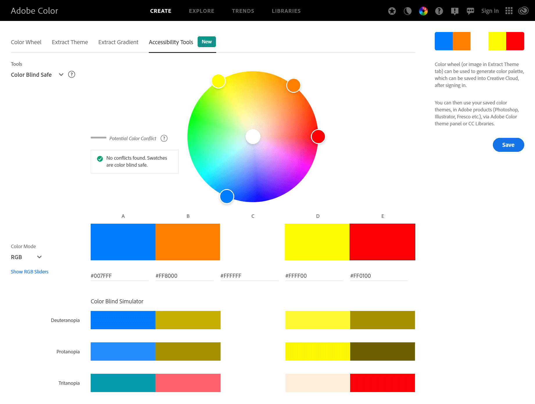
The first tool is a Colour Blind Safe checker where you can compare five colours and be notified if there are any which will be bad for colour blind people:
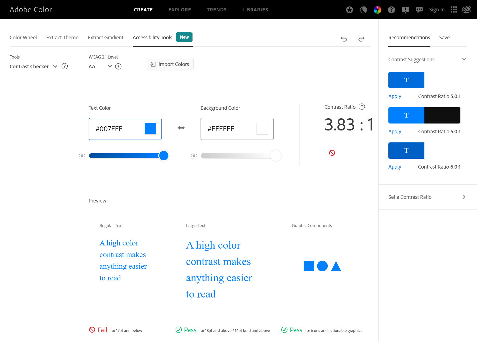
The second tool is a Contrast Checker which will sow you the contrast ration of a selected colour (the higher the contrast ration the better):
What should we write about next?
If there is a topic which fits the typical ones of this site, which you would like to see me write about, please use the form, below, to submit your idea.