 In the last post on Gutenberg, I introduced Gutenberg; in this post I thought it might be useful to cover how it works.
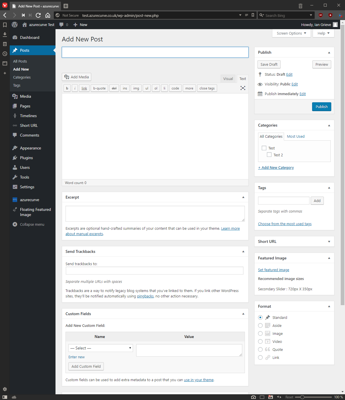
It works with blocks. Gutenberg replaces the old TineMCE Editor which looked like this:
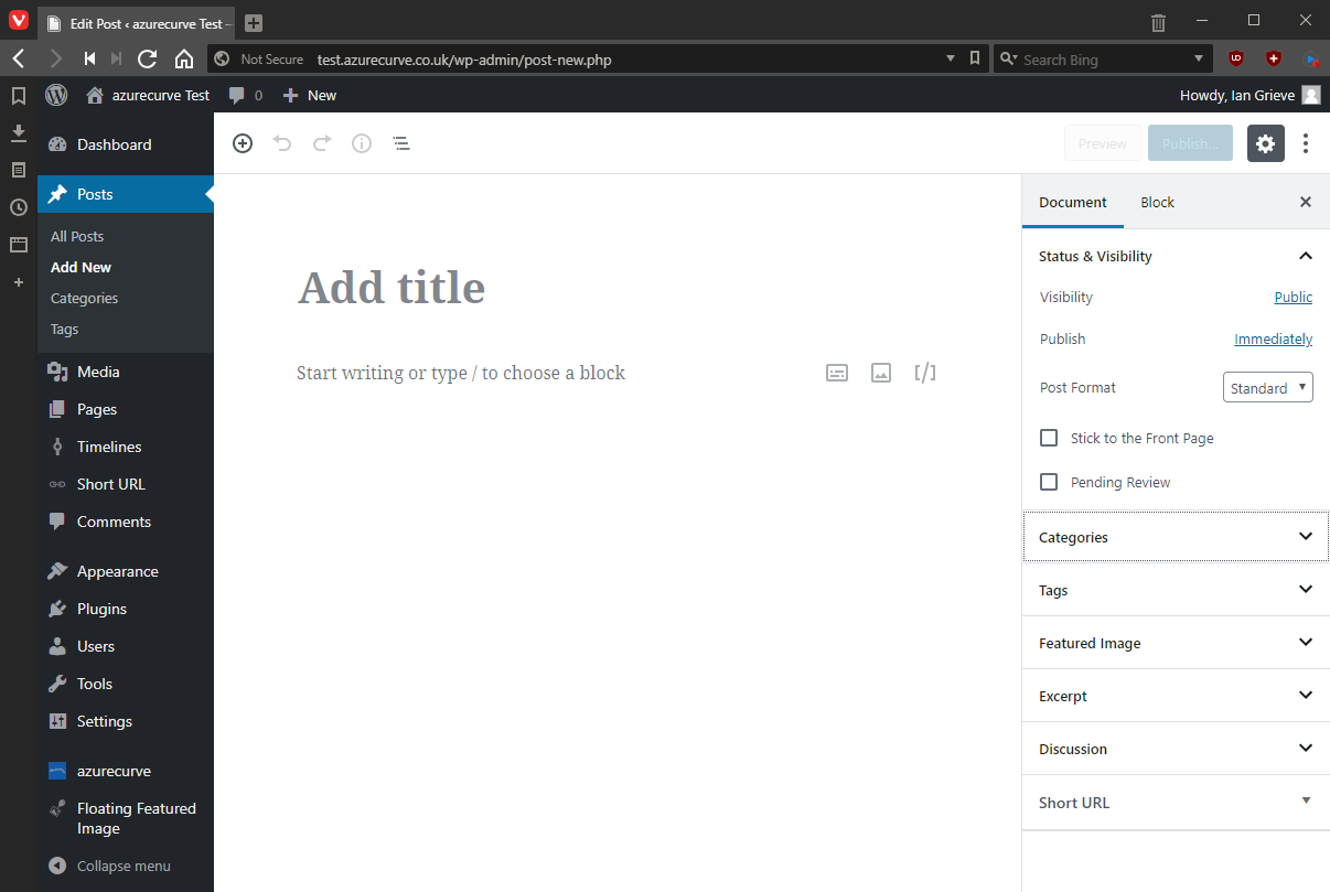
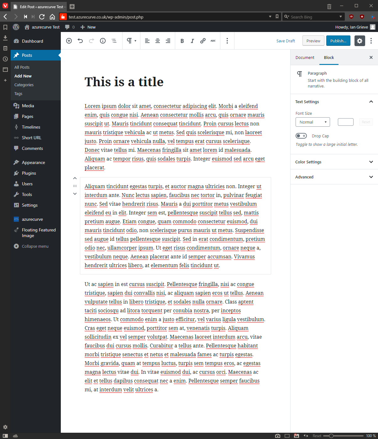
The new Gutenberg Editor looks like this, where the interface is much simplified with the sidebar compressed into one block; when you start a new post, it shows the Document level options:
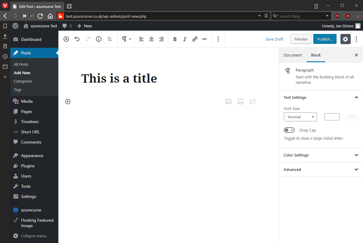
When you create a block, such as a title by tying into the default block shown in the editor, the sidebar changes:
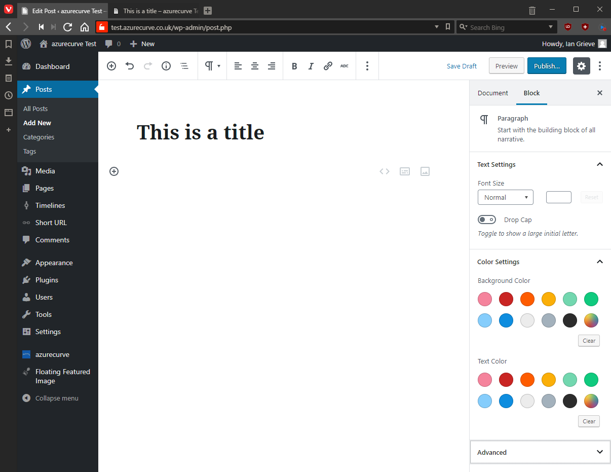
I’ve moved the cursor to the default normal block and expanded a few of the options available in the sidebar:
I can see why people might like this, but in general I want options like these to be controlled via CSS which means I can set a class to a paragraph, or other element, and then update the stylesheet and have all of these elements update at the same time. If you use these sidebar options, any future change needs every single element so formatted to be manually updated.
When you enter text into the Gutenberg Editor, every time you hit return, a new normal bock is inserted:
I’ve noticed, if I try to select multiple blocks in the editor by left clicking the mouse and sliding up, the blocks fail to select properly and the screen jumps uselessly around.
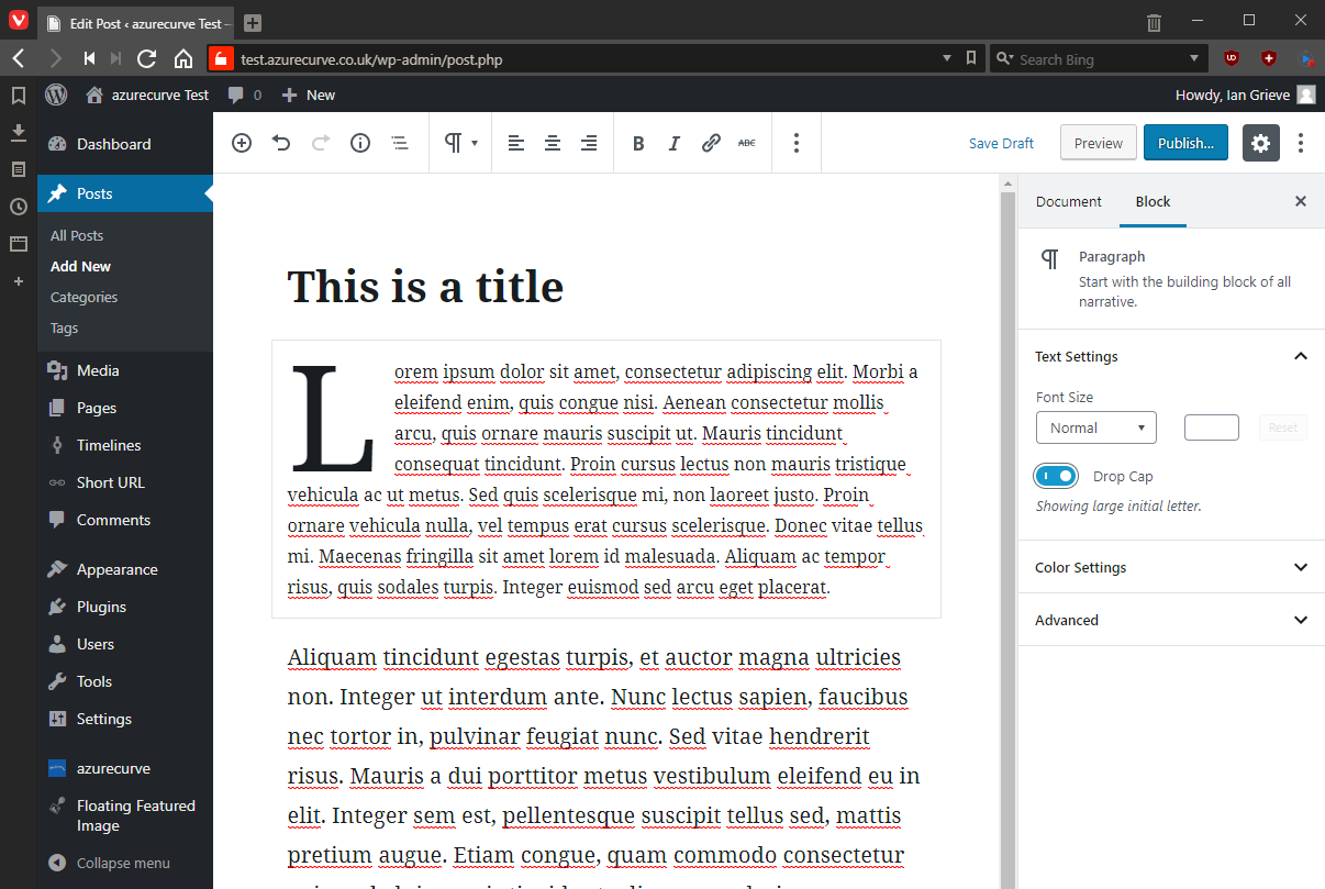
I’ve formatted first paragraph to have a drop capital and the second paragraph to a larger size:
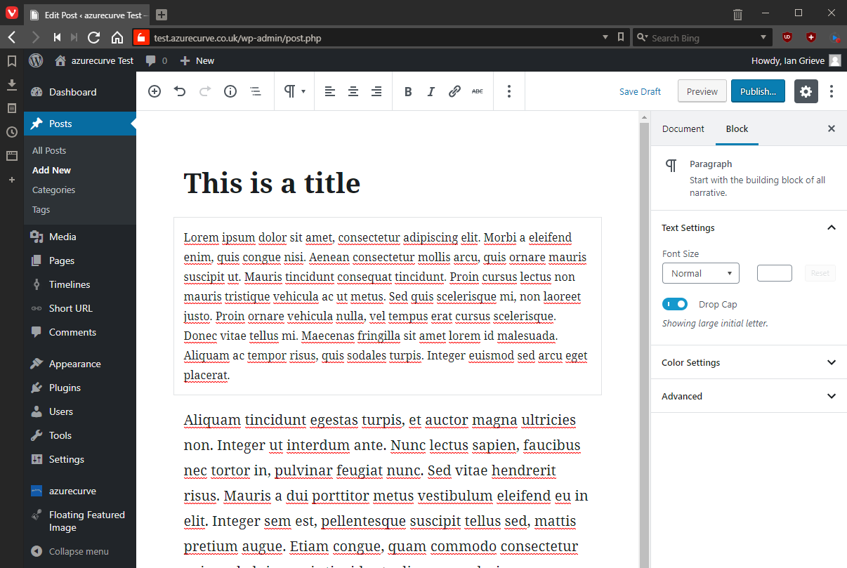
One of the selling points of Gutenberg, is what you se in the editor is exactly what will be visible to the user reading the post on the site. However, I’ve noticed that if I click on the paragraph with the drop capital, the drop capital actually disappears (it is still there but not showing):
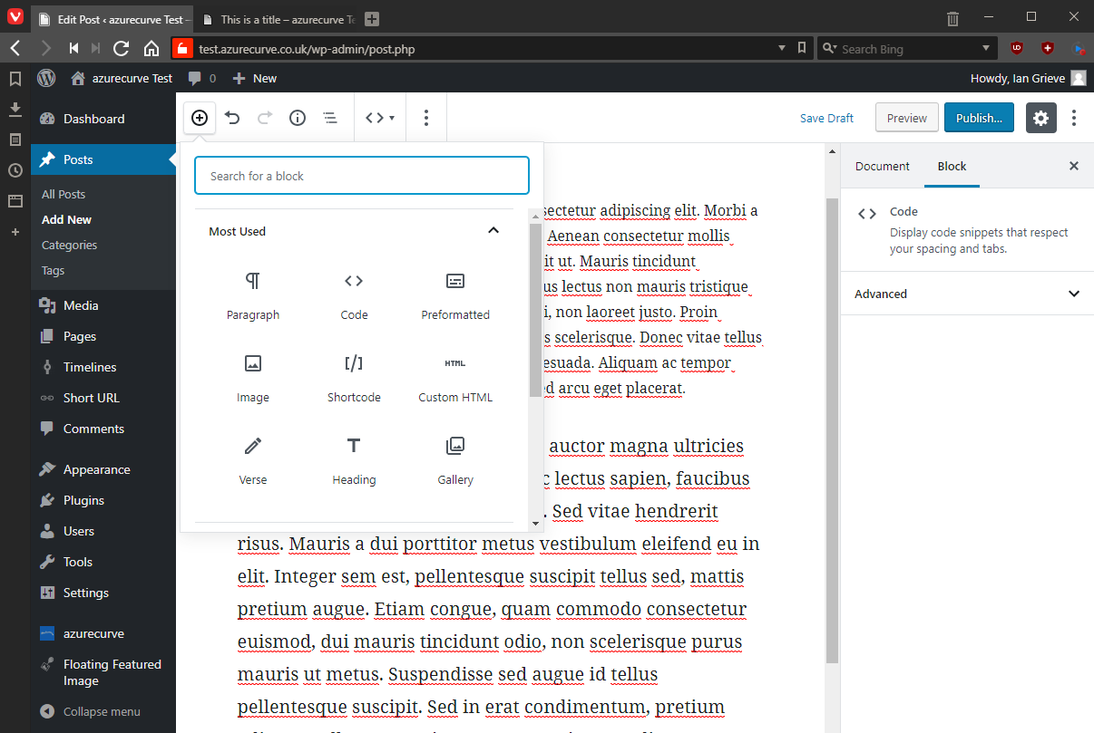
Other types of block can be inserted by clicking the plus icon in the toolbar:
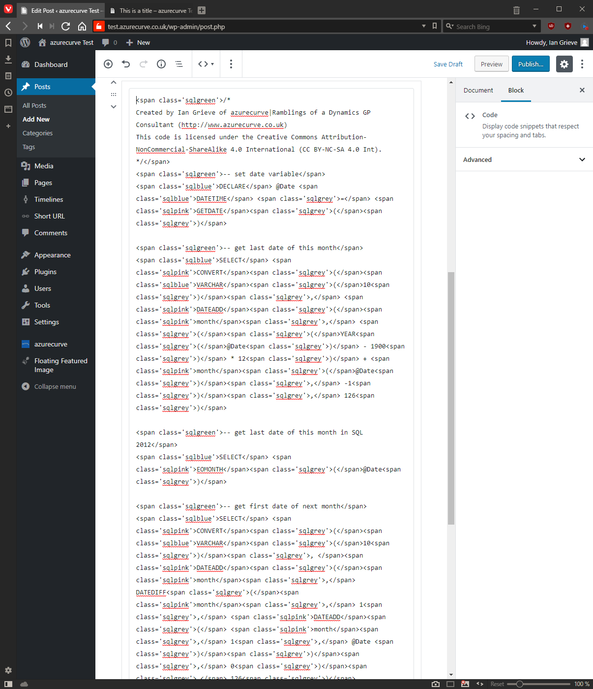
I’ve added a code block and added some styled code:
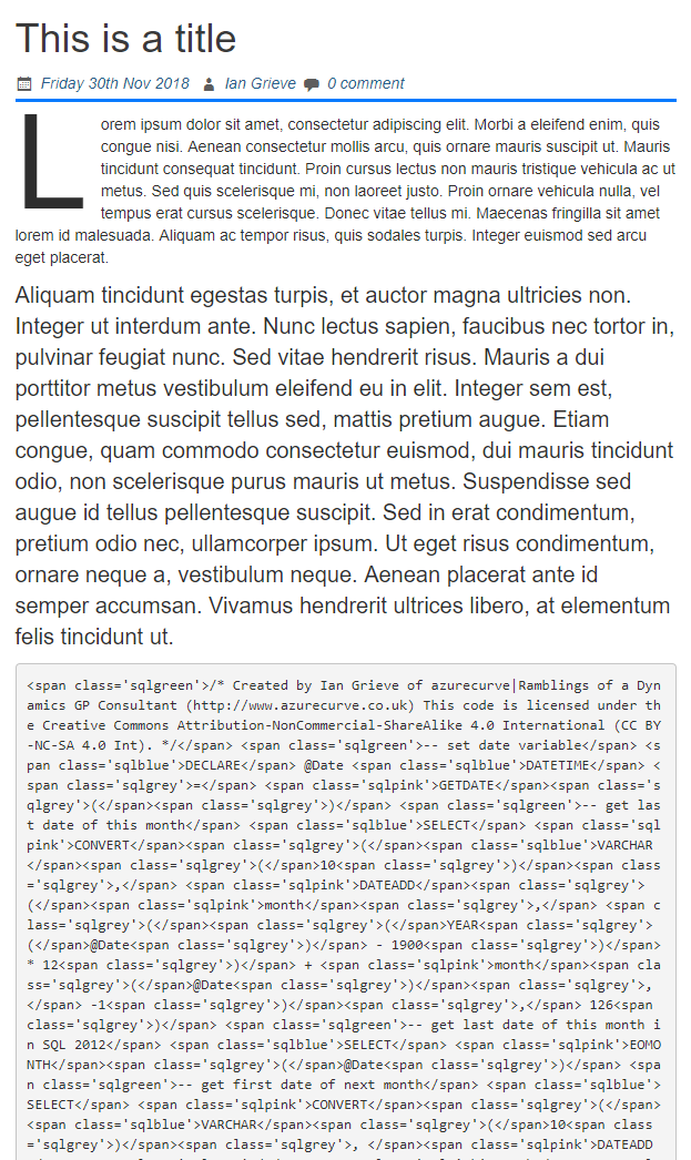
When previewing the page, the HTML of the formatted text is displayed and all line breaks removed:
I’ve played around with various options and ways of working with Gutenberg, and there are some good elements in it.
Much of the formatting elements, such as drop capital, should be handled via CSS rather than the user formatting them every time. I’d recommend formatting in CSS rather than blocks so that you have control and can update the CSS in one place and have all related content updated in one hit.
There are also some annoying bugs; one I’ve found that, is that once a post has been posted, any changes cannot be viewed via a preview.
However, I don’t find it especially useful for my workflow, which is why I’ve started looking at options (more on this fairly soon).
Click to show/hide the Gutenberg for WordPress Series Index
What should we write about next?
If there is a topic which fits the typical ones of this site, which you would like to see me write about, please use the form, below, to submit your idea.




Hi Ian,
I agree mostly with your findings about Gutenberg.. however, your points are valid when you use hosted WP with your own provider and options of all the settings, especially when it comes to CSS.. unfortunately this is not an option with the free WP.com environment where you cannot define CSS Classes to your text blocks, as this is only available for paid edition of WP.
Seeing that Gutenberg was (or is) actually a plugin to the hosted version of WP, I’m considering eventually to setup my own WP server at home and move my blog to it.. this may get me more flexibility in the appearance of the blog pages.
Yes,with the wp.com you are very limited.
Gutenberg is moving into core in WordPress 5 when it is released on Thursday; and that is only phase 1. The longer plans for Gutenberg is to takeover customiser and more.
I have a web host who just gives me a hosting environment; everything on there I installed and maintain. I did this for the flexibility of using any theme or plugin I wanted.