 Microsoft Dynamics GP 2013 R2 is now available. And despite not really having the time to do so at the moment, I can’t stop myself from installing it (and as I always do blogging about it as I go).
In this series of posts I am going to do install a stand-alone instance of Microsoft Dynamics GP 2013 R2; the index for this series is here.
Well, with Microsoft Dynamics GP 2013 R2 installed the next step is to take a look at it. Having been reading, and transposing into posts, the Feature of the Day articles from Microsoft I do have some idea of what is coming. But for those of you who haven’t been reading along, I figured I might as well do a short post.
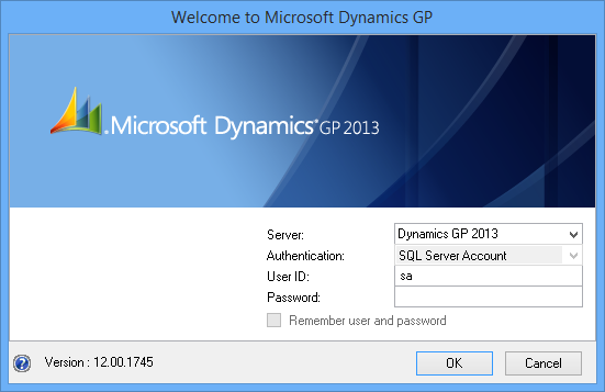
Once you have GP installed and either the Fabrikam company deployed or a company created you can log in. To do this find the GP shortcut on the start screen. This will launch GP where it will prompt for a username and password. If you haven’t previously been logged into GP and created a user then log in as either the sa or DYNSA user:
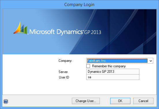
After successfully logging in you will be presented with the Comapny Login window. All company to which your user has access will be available for selection. I have chosen to log into the Fabrikam, Inc sample company:
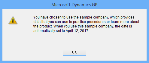
As the main GP window load you will, assuming you have also selected the sample company, be presented with a warning message to this effect; click OK to continue:
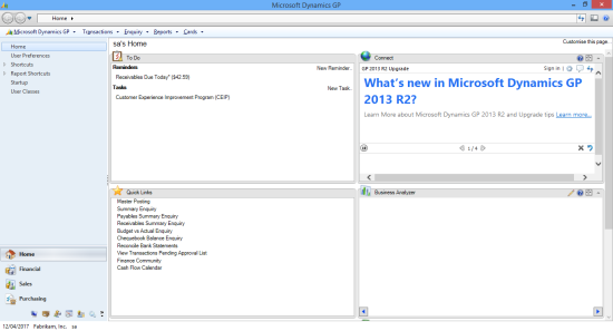
The main Dynamics GP window and home page are very similar to the previous version. In fact it took me a few minutes to identify what main difference was (it was nagging at me,but I couldn’t place what was different); the main window has lost the blue on the menu bar at the top and has a light grey in it’s place:
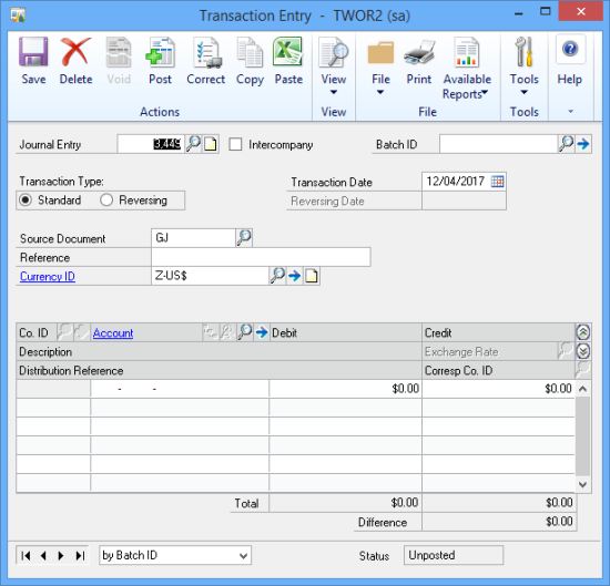
When you open a window, I have opened the General Ledger Transaction Entry one (), you will see that the menu bar has been removed and the toolbar has become a ribbon bar:
Previously, the user id, date and company were displayed at the end of the toolbar; company and user id (the latter in round brackets) is now displayed in the title bar of the window. The options formerly on the menu bar are now available via the Tools button on the ribbon.
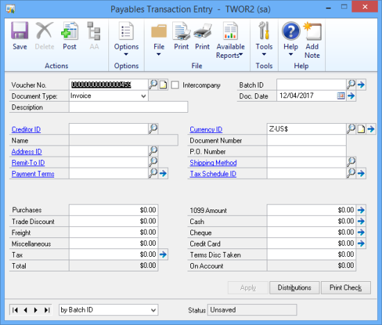
Below is a screenshot of the Payables Transaction Entry window ().
As you can see, the buttons at the bottom of the window, such as Notes and Help are now buttons on the ribbon as well; the introduction of the ribbon is making these windows look far more like the web client than they did in any of the previous versions. This can only be a good thing as clients are starting to look at deploying the web client and I think many of them may end up as mixed deployments where both the web client and desktop clients are in use.
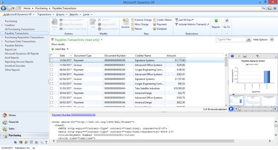
Navigation Lists are still present and function as they always did; they also look different due to the blue being replaced with grey:
When I first saw Microsoft Dynamics GP 2013 I felt that some of the icons, which had been updated, looked a bit rough and this had not changed by SP2; Dynamics GP 2013 R2 looks very smooth and clean. All of the icons are sharp and the introduction of the ribbon has left the client feeling very modern and fits in with related products such as Office and SharePoint.
Even as I was thinking I am sounding like a fanboy, I suddenly realised I was going to end with two criticisms:
- The detail section in the Navigation Lists does not work for me; the first one I opened displayed an error I clicked on without reading so I don’t know what it said, but since then no Navigation List has worked correctly (I need to investigate this further);
- The Payables Transaction Entry window has not been correctly language packed; it says Print Check instead of Print Cheque (I’m really not sure if it has always done this or if it is new in 2013 R2; I might be criticising a long standing issue which I have only just noticed.)
What should we write about next?
If there is a topic which fits the typical ones of this site, which you would like to see me write about, please use the form, below, to submit your idea.




In GP 10 the button in Payables Transaction Entry also says ‘Print Check’ instead of ‘Print Cheques’. The other areas such as Select Cheques seem to be properly localized.
I’ve been meaning since I posted this to check what GP 10 and 2010 had for the language and kept forgetting; thanks for doing it for me 🙂