 As mentioned, Windows 8 Developer Preview now available for download here which I have done.
First impressions are very positive. Overall it’s snappy and easy to use and I do like the look of the Metro UI; I’ve seen it on colleagues smartphones and always quite liked the look of it but I did wonder how well it would translate onto a desktop. The answer appears to be very well.
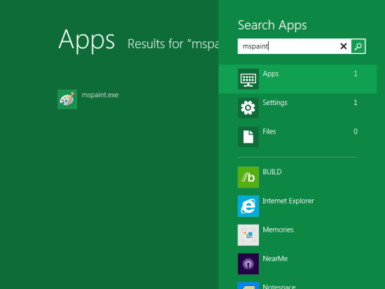
Win+typing still allows you to search for programs (hitting return opens the top result);
No longer does this launch the Windows Start Menu but the Metro Home Screen. This is one of the features I was most skeptical of but it does work very well.
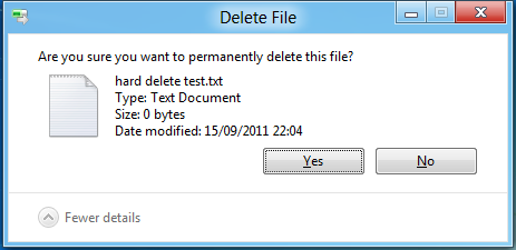
One difference that may take me some getting used to is Delete; if you select a file and press Delete the file is immediately deleted with no prompt although a hard delete (SHIFT+DEL) does still prompt;
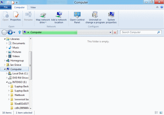
Windows Explorer now has a ribbon bar;
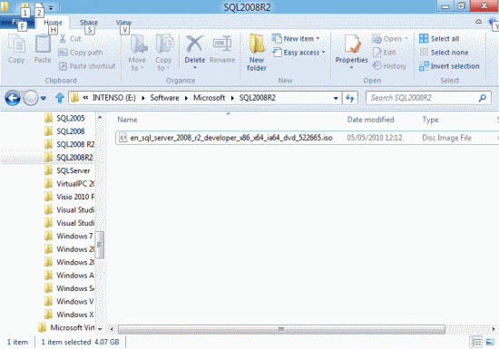
Which changes depending on where you are in explorer (with Alt keys available as always);
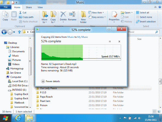
The copy dialog now shows you more detail including a graphical representation of speed over the time of the copy;
I am definitely impressed with this Developers Preview and, based on an admittedly very short time using it, can’t wait for the final version to be available.




3 thoughts on “Windows 8 Developer Preview First Impressions”